A photo essay


Spoiler consideration: If you haven’t read The Picture of Dorian Gray, this post won’t entirely ruin it for you, but it hints at content that you should ideally read in the book first.
Disclaimer: I’m not Oscar Wilde or John Berger, so obviously this imagined conversation between them is impossible based on not only person but also timeline. It’s simply a conversation of my own imagination.
Now to the post:
BERGER: Don’t you think “An image is a sight which has been recreated or reproduced. It is an appearance, or a set of appearances, which has been detached from the place and time in which it first made its appearance and preserved — for a few moments or a few centuries. Every image embodies a way of seeing” (9-10).
WILDE: Certainly that picture of Dorian was one that sought to reproduce a face that was Basil’s muse. Basil never imagined, though, that somehow it wouldn’t fully detach, that it would maintain Dorian even as it sought to capture a fleeting moment of his youth as the artist saw him. That reminds me of a conversation Basil had with his friend Lord Henry. Basil said to him, “I know you will laugh at me . . . but I really can’t exhibit it. I have put too much of myself into it.” Lord Henry responded, “Too much of yourself in it! Upon my word, Basil, I didn’t know you were so vain; and I really can’t see any resemblance between you” (2). It captured Basil’s own “way of seeing” Dorian even as it held Dorian himself.
BERGER: That Basil’s own view of Dorian was so integrated into the painting shows “our perception or appreciation of an image depends also upon our own way of seeing” (10).
WILDE: Basil’s view of Dorian inspired the image, but what gave the painting life was Dorian himself, how he perceived himself in the present and in the future.
BERGER: “Images were first made to conjure up the appearances of something that was absent. Gradually it became evident that an image could outlast what it represented; it then showed how something or somebody had once looked — and thus by implication how the subject had once been seen by other people. Later still the specific vision of the image-maker was also a recognized as part of the record” (10).
WILDE: While I would agree, my allegory theorized another layer to that understanding. I wanted to show that idea that Basil painted an appearance of Dorian that would soon be gone, his youth. Little did Basil expect that Dorian’s youth would remain and the image itself would be the thing that came to truly represent who Dorian became. The image was the record of the present, not the absent.
BERGER: “No other kind of relic or text from the past can offer such a direct testimony about the world which surround other people at other times. In this respect images are more precise and richer than literature” (10).
WILDE: As a author whose works are known for offering testimony to human reality, I don’t know that I can fully agree. Oh, yes, I understand that there is something in an image that is static and of course visual in a way that my words can’t be, but Dorian as a person is a testimony of a time and a way of thinking that is both precise and rich. Perhaps an image might best represent the physical world, but literature has power in testifying to the humanity that shapes the world.
BERGER: What do you think of this idea: “One might argue that all reproductions more or less distort, and that therefore the original painting is still in a sense unique” (20).
WILDE: In actuality, perhaps, but in allegory, other possibilities arise. What if a reproduction distorts the original, however unique the two might be? I would say that “All art is at once surface and symbol. Those who go beneath the surface do so at their peril. Those who read the symbol do so at their peril. It is the spectator, and not life, that are really mirrors. Diversity of opinion about a work of art shows that the work is new, complex, and vital” (Preface). These reproductions are different layers of understanding of the surface and symbol of the work itself, each unique as you say. Basil’s image of Dorian was at first a reproduction. That reproduction, however, gained the power to distort both the original and itself.
BERGER: And what do you think of the value of art? “If you buy a painting you buy also the look of the thing it represents” (83). Therefore, “Before they are anything else, [paintings] are themselves objects which can be bought and owned. Unique objects. . . . They show [the buyer] sights: sights of what he may possess” (85).
WILDE: That’s what Dorian found: “The sense of his own beauty came to him like a revelation. He had never felt it before” (22). He found that “When one loses one’s good looks, whatever they may be, one loses everything” (23). In his desperation to own himself, his representation and his truest self, he says, “I am jealous of the portrait you have painted of me. Why should it keep what I must lose?” (23). He saw as you see that the image would keep something, would be a thing to own and possess. As a self-portrait, the picture was a chance to own himself, or so he thought. In reality, the picture came to own him.
BERGER: I’ve found that “the painted public portrait must insist upon a formal distance. It is this — and not technical inability on the part of the painter — which makes the average portrait of the tradition appear stiff and rigid. The artificiality is deep within its own terms of seeings, because the subject has to be seen simultaneously from close-to and from afar. The analogy is with specimens under a microscope” (97).
WILDE: There I found that Dorian’s image could hold a different power. Rather than being at a formal distance, the picture of Dorian came to be the most intimately connected being to Dorian, the one that knew him best. Dorian tells Basil, “Appreciate it? I am in love with it, Basil. It is part of myself. I feel that.” Basil responds, “Well, as soon as you are dry, you shall be varnished, and framed, and sent home. Then you can do what you like with yourself” (24). As Dorian removes the painting from public eye, it becomes more and more a personal thing.
BERGER: Well, I suppose, “Their purpose was not to transport their spectator-owners into new experience, but to embellish such experience as they already possessed. Before these canvases the spectator-owner hoped to see the classic face of his own passion or grief or generosity. The idealized appearances he found in the painting were an aid, a support, to his own view of himself. In those appearances he found the guise of his own . . . nobility” (101).
WILDE: That may be true of an ordinary painting. But a true image of oneself is really one’s own being. Perhaps the image is the more honest representation and the breathing persona is the guise. Basil was only half right when he told Dorian, “I will destroy it. What is it but canvas and colour?” (24). The painting is only the painting and at the same time might represent everything a person is, both capturing the represented participant and some of the artist. Lord Henry was certainly misguided when he expressed, “An artist should create beautiful things, but should put nothing of his own life into them” (10). That is an impossible feat. And if a picture is showing reality, can it really capture nobility?
BERGER: True, it is impossible to be fully detached from what we create or what we see, for “We never look at just one thing; we are always looking at the relation between things and ourselves. Our vision is continually active, continually moving, continually holding things in a circle around itself, constituting what is present to us as we are” (9). But in that vision, we can choose to represent or see what we want in an image.
WILDE: Hmm. Yes, we are always looking, and that gaze is always showing us something. If only Dorian had thought to look a bit more at the vision of his own life in his picture, for it was more than “evidence” or perhaps it was all evidence but in a way he didn’t understand because of the bias of his own vision (203).
Works Cited
Berger, John. Ways of Seeing. British Broadcasting Corporation and Penguin, 2003.
Wilde, Oscar. The Picture of Dorian Gray. AmazonClassics, n.d.
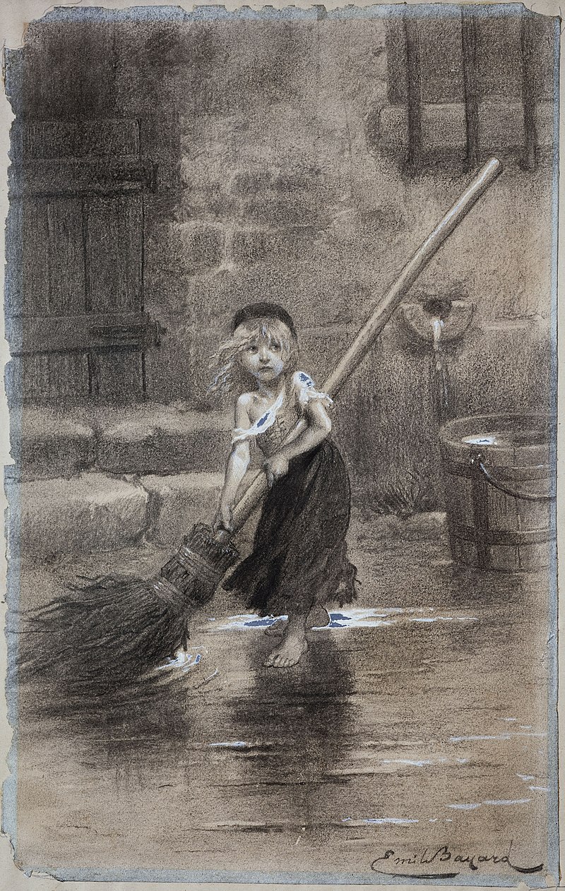
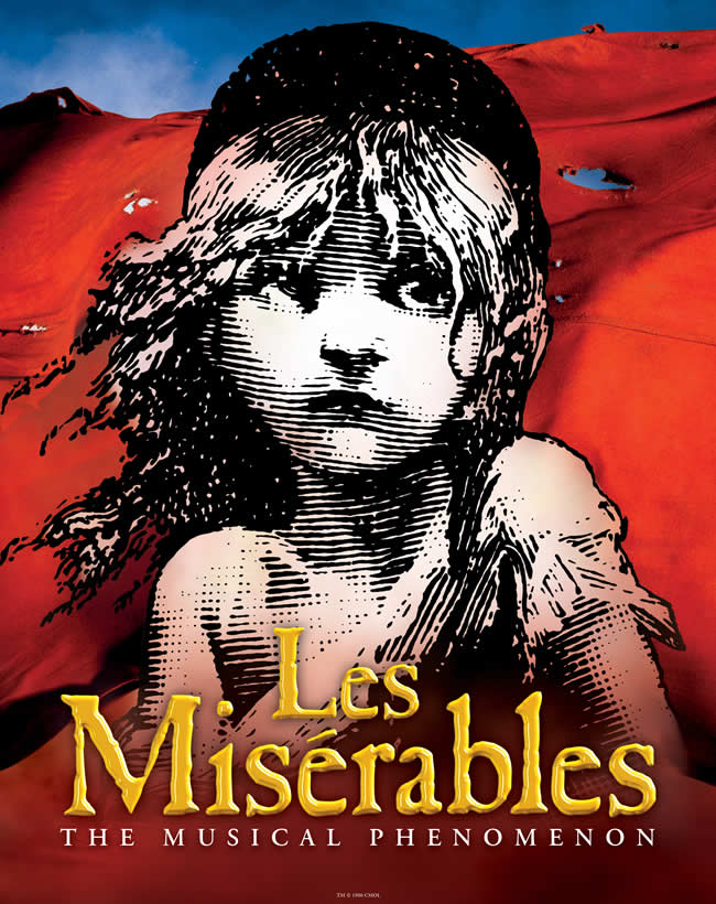
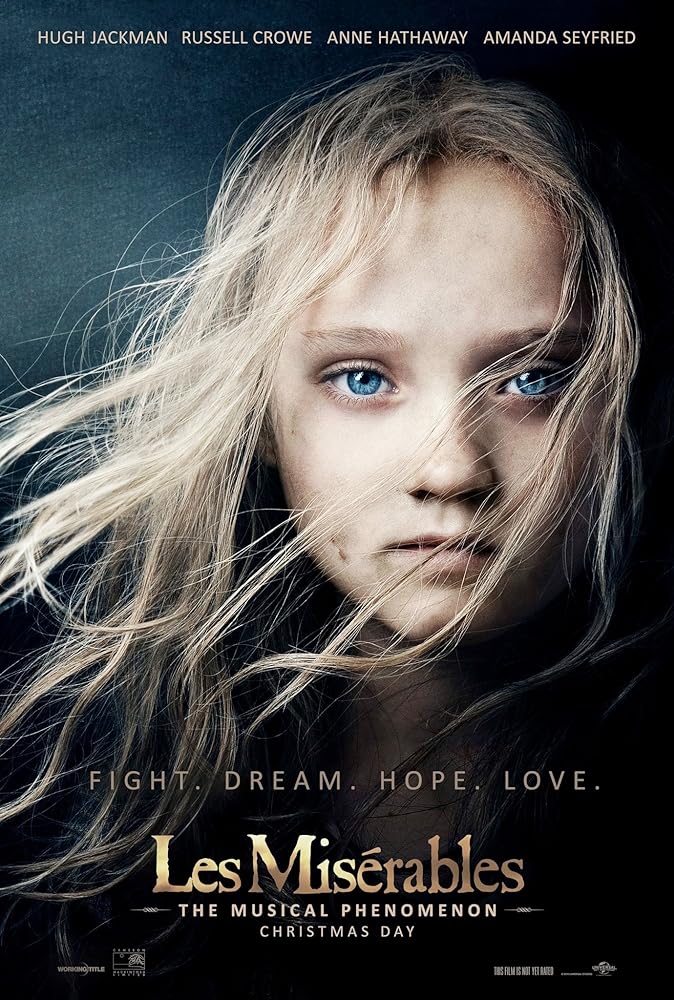
If you follow musicals at all, or perhaps even if you don’t, this famed Cosette pose is one that likely is familiar. However, while perhaps that black-and-white face with the colors of the French Revolution behind are emblematic of beautiful musical scores, Cosette’s development from her original to these adaptations demonstrates the power of visual representation.
Take Emile Bayard’s original engraving: the represented image is that of Cosette as a child, working for the Thenardier family. She’s alone. She’s wearing rags. She’s sweeping with a broom twice her size, barefoot. So how does this image connect with the interactive participant?
Gunther Kress and Theo VanLeeuwen, in their book Reading Images: The Grammar of Visual Design, write that “interactive participants are therefore real people who produce and make sense of images in the context of social institutions which, to different degrees and in different ways, regulate what may be ‘said’ with images, how it should be said, and how it should be interpreted” (114). When first published as an illustration, Bayard’s work was likely a depiction of the time, something that Hugo’s readers might see as an injustice in their own streets. In current context, the picture seems a depiction of history, documentation of time past when little girls wore long dresses and brooms were made of straw.
While society has changed, an element of Bayard’s original still illicits a response: what Kress and VanLeeuwen describe as a gaze that “demands something from the viewer, demands that the viewer enter into some kind of imaginary relation with him or her” (118). Cosette’s longing look makes eye contact with the viewer and submits a demand, a plea that something might change in her situation.
It is this demand that remains in the adaptations of Cosette’s image. With the arrival of the Les Miserables musical, Cosette became quite literally the poster-child. However, while her demand remains the same, her distance changed. An “intimate distance” of her head and shoulders only brings the interactive participant into close social distance (Kress and VanLeeuwen 125). Her eyes are big, her face present and prominent. As a black-and-white sketch generally backed with vivid red and blue, Cosette is almost ghost-like in her plea to the viewer. This dramatic interaction prepares the viewer for the musical, for the plea for justice that weaves through the performance.
When the 2012 live-action film of the musical came out, one of the movie posters maximized on what Broadway had discovered: this Cosette image works. Using the same eye-level demand, “the point of view is one of equality and there is no power difference involved” (Kress and VanLeeuwen 140). While it might seem that adapting the image to give the interactive participant a high angle of power over Cosette, keeping the horizontal interaction makes an notable exchange. While Cosette’s poverty is obvious and gives the viewer some sense of superiority, Cosette returns the gaze, demanding a response, holding a power of her own.
Cosette has come to represent perhaps the most well-known musical in the world. Her face, her demanding gaze, her eye-to-eye interaction, her close-up vulnerability continue to draw readers in as she claims her own role in the phenomenon.
Works Cited
Bayard, Emile. Young Cosette Sweeping. 1886, Les Miserables. Wikimedia Commons, commons.wikimedia.org/wiki/File:Ebcosette.jpg.
Kress, Gunther and Theo VanLeeuwen. “Representation and Interaction: Designing the Position of the Viewer.” In Reading Images: The Grammar of Visual Design. 2nd ed., Routledge, 2006, 114-153.
Les Miserables: The Musical Phenomenon. 2012, Universal Pictures. IMDB, http://www.imdb.com/title/tt1707386/mediaviewer/rm2769463552.
Les Miserables: The Musical Phenomenon. 2020, Broadway San Diego, http://www.broadwaysd.com/upcoming-events/les-miserables-2020/.
“Every time you open a new document in a page layout program, you are prompted to create a grid.”
(Lupton 178)
I started this process with that intimidating empty white page in front of me. It was more intimidating than usual because I was thinking of it in a different way than I had ever consciously thought of it before, as a grid.
I had ideas, but wasn’t quite sure how to apply them. Then, I turned to Pinterest. Pinterest offers both endless ideas and ideas that are endless (Pinterest). However, the idea of using blocks to form the newsletter was evident in many of the examples and is one I applied in my own way in this newsletter:
https://drive.google.com/file/d/1EpaNZj0WUxxpkMI_Od4ULbH62aM7uWR-/view?usp=sharing
Armed with ideas, this design project still offered more challenges than I anticipated because of that very important thing for any company, organization, or institution: branding. The branding guide specified color ratios, logo placement measurements, and other elements that while understandable, I found hard to work with. It was a bit like completing a color-by-number activity when you’re ready for a grown-up coloring book or even an empty page. (Granted, I realize it’s the “grownups” that work with branding guidelines, so this comparison doesn’t go far beyond my feelings.)
I wanted to have big letters with the newsletter “seasons” running behind the logo, but according to the logo placement directions, the logo needs to be on solid or non-distracting backgrounds. I also faced the challenge of not knowing how to accomplish what I can picture in my head or even what program to use.
I tried Word for this assignment, which I’m fairly comfortable with. I would guess that Publisher, or maybe even PowerPoint, might have offered more of the options I was looking for: things like adding texture to the plain shapes or softening colors without using gradients. With that last idea, though, I wasn’t sure if that changed the colors too much from the branding guidelines, so I stuck with the untouched color squares.
What did work was fitting the text on two pages with some white space to spare. Part of that was accomplished by applying one of Robin William’s CRAP design elements: “The Principle of Alignment states: Nothing should be placed on the page arbitrarily. Every item should have a visual connection with something else on the page” (33). Thinking of Ellen Lupton’s “Grid,” particularly the modular grid, I used the ruler tool on Word to align the boxes based on thirds. Boxes either take up one third or two thirds of the width of the page. I definitely thought in columns more than rows with the grid idea.
Inspired by Lupton’s idea of the grid being “a skeleton structure that moves in concert with the muscular mass of information,” I tried to work within the bones while allowing for some movement through color and horizontal alignment (Lupton 151). The most prominent horizontal choice is the red band that spans both pages. Molly Bang in her book, Picture This, writes, “Smooth, flat, horizontal shapes give us a sense of stability and calm” (52). As a newsletter for an educational institution, I left behind the idea of a diagonal slash across the page and chose the formal of the horizontal line.
The text is grouped somewhat by color. Bang notes, “We associate the same or similar colors much more strongly than we associate the same or similar shapes” (97). The course offerings are both in orange while the capstone and proposal information are in yellows. I did consider trying circles, but I felt like blocks and circles with the primary and secondary colors might seem a bit too much like children’s building blocks.
The final assignment might not be one to post on Pinterest. It (mostly) meets the branding guidelines, though I’m not sure how my color percentages ended up. It communicates the information. It doesn’t do so beautifully quite yet, but I learned in the process and for future newsletters would be quick to use a new program and try some different tactics in accomplishing the goal.
Works Cited
Bang, Molly. Picture This: How Pictures Work. Chronicle Books LLC, 2016.
Lupton, Ellen. “Grid.” Thinking with Type: A Critical Guide for Designers, Writers, Editors & Students. 2nd Ed. Princeton Architectural Press.
Pinterest. Pinterest, 2020, http://www.pinterest.com/.
Williams, Robin. The Non-Designers Design Book: Design and Typographic Principles for the Visual Novice. 4th ed., Peachpit Press, 2015.
A picture speaks a thousand words.
It’s a common enough phrase. It comes up when someone comes across a childhood memory captured in a wrinkled photograph as often as it comes up when there is a celebrity scandal documented for all to see. The underlining assumption is agreed upon: pictures communicate.
Recently, I came across a two-part podcast interview with Kelsey Nielsen on the Good People podcast that focused in part on this very idea of what pictures communicate.
https://www.stitcher.com/podcast/kelsey-timmerman/good-people-with-kelsey-timmerman
Toward the beginning of “Part 1,” Kelsey Timmerman, the primary host of Good People, explains that international ministries and travelers use photography of the very people they are present to help as an unintentional form of exploitation:
“There’s big money in that” (“Part 1” 15:16-19).
While the show discusses a wide range of topics, what Jay Moorman, a co-host, notes is that
“There are some well-meaning people. . . . [Unintentional exploitation is] more irresponsible than it is evil” (“Part 1” 41:00-28).
In the specific situations discussed in this podcast, Nielsen agrees but emphasizes the importance of changing methods once realization occurs. When an action becomes noticeably irresponsible, there is then responsibility to change.
Nielsen helps to run the organization and active social media platform No White Saviors. While topics on the Instagram page are broad, one area of activism focuses on the use of social media and photography by “white saviors.” A recent post includes a graphic of this question:
“How are the human beings in your photos, stories & films really benefiting?” (@nowhitesaviors).
The words “human beings” are bold and purple, making those words stand out against the colors of the rest of the image, focusing on humanizing the subjects. The comments of the post include additional thoughts on the ethics and benefits of photography of marginalized peoples.
Nielsen and the Good People podcasts that include her interview recognize the power of a picture because of the number of words it speaks and whom those pictures often are speaking for. While visuals are just a part of the podcast, the topic has me thinking about my own responsibility in visual communication. As someone who has traveled and worked with marginalized people groups and anticipates more of those interactions in my future, I want to be conscious of the visual rhetoric of my communication. What I post visually will be remembered far more than the written comments that will accompany the pictures.
Moorman closes the “Part 2” podcast with two takeaways for communication: “intention” and “perception” (56:15-57:23).
While I’m no photographer, I found that the “Code of Ethics” from the nonprofit Photographers without Borders offers helpful considerations for the way photographs speak beyond just intention and perception. Among their eight primary guidelines are phrases like
“people have voices,” “learn and listen as much as possible,” and “treat all subjects with respect and dignity” (“Code of Ethics”).
The guidelines place people before the photograph and the photographer, offering specific guidelines for taking pictures and sharing them responsibly.
https://www.photographerswithoutborders.org/code-of-ethics
In a world where our words seem to be increasingly spoken by pictures, those thousand words said over and over matter. Gillian Rose, in Visual Methodologies: An Introduction to the Interpretation of Visual Materials, writes,
“All these different sorts of technologies and images offer views of the world; they render the world in visual terms. But this rendering, even by photographs, is never innocent. These images are never transparent windows into the world. They interpret the world; they display it in very particular ways” (2).
As pictures often do the communicating, the time and care taken with the written word should be taken in crafting the visual word. After all,
A picture speaks a thousand words.
Works Cited
“13: Kelsey Nielsen of No White Saviors Part 1.” Good People, from Sticher, 4 July 2019, http://www.stitcher.com/podcast/good-people-with-kelsey-timmerman/e/62362096?autoplay=true.
“14: Kelsey Nielsen of No White Saviors Part 2.” Good People, from Stitcher, 18 July 2019, http://www.stitcher.com/podcast/kelsey-timmerman/good-people-with-kelsey-timmerman/e/62651111.
@nowhitesaviors. “We’ve really been enjoying having our friend . . . ” Instagram, 2 Feb. 2020, http://www.instagram.com/p/B8EJMoWhAhR/.
“Code of Ethics.” Photographers without Borders, 2018, http://www.photographerswithoutborders.org/code-of-ethics.
Rose, Gillian. “Researching Visual Materials: Towards a Critical Visual Methodology.” Visual Methodologies: An Introduction to the Interpretation of Visual Materials. 2nd ed., Sage, 2007, pp. 1-27.

Typefaces have power, have emotion. Because typefaces offer a variety of emotions, I wanted to work to convey that variety. Robin Williams, in The Non-Designer’s Design Book, begins her teaching on typeface with this idea:
“never forget that your purpose is communication. The type should never inhibit the communication” (149).
Generally, the purpose of communication includes expressing an emotion. Type should not only “never inhibit” that emotion but also work to express that emotion. When one considers the variety of human emotion, the variety of typefaces begins to make more sense.
“Typography endows human language with visual form” (Williams 150).
As I considered what I wanted to show in this week’s exercise, I wanted to capture a taste of human emotion and how those emotions are expressed through typefaces. The background image shows that variety of human emotion, providing a focus on one extracted image–the winking face–to hint at the irony trying to capture human emotion in a single image.
Then, there are the typefaces themselves, in a variety of fonts, rescaled, reoriented, and rotated. I tried to include a variety that reflects William’s idea of type being like life:
“Within these dynamics on the page (or in Life), a relationship is established that is either concordant, conflicting, or contrasting” (167).
As life is full of emotion, so are typefaces. Choose wisely. As Williams encourages,
“Never forget that your point is to communicate” (174).
So, if fonts are there to communicate, how does that apply practically?
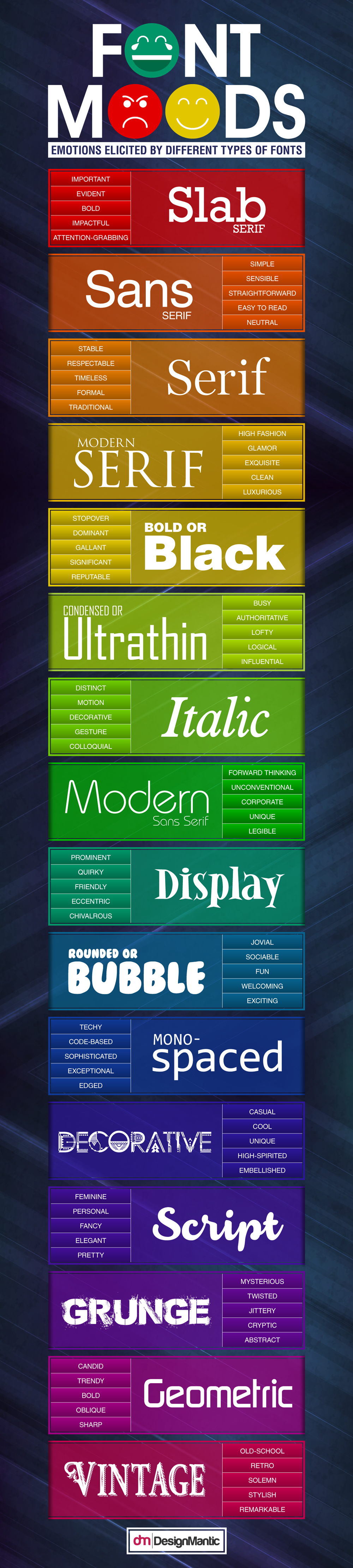
Evan Brown of DesignMantic, in his blog post “Font Moods: Emotions Elicited By Different Types Of Fonts!”, instructs designers:
“Keep in mind that a typeface can say as much about the project as your written words on a page. . . Fonts elicit an emotional response from the readers, complement products, help to communicate the underlying meaning of a product, and employ visual cues to set expectations about the product.”
Brown offers this infographic to demonstrate his point:
Another designer also speaks to this power of emotion when using typefaces. Sarah Hyndman, in her TEDx Talk “Wake up & smell the fonts,” argues for the emotions of fonts and their ability to tell stories. She questions:
“How do fonts influence us without us really knowing about it? They work a bit like clothes. When we see them, they make a first impression . . . the clothes a person wears tells the world who they are” (6:15-6:44).
As a designer, Hyndman has learned that fonts have power to communicate the feelings that Brown lists in his infographic. She uses slides to demonstrate that the same words with different typefaces and fonts convey different meanings about a business, a clothing brand, a candy.
“Typefaces can communicate with our subconscious. They leave the conscious brain to read what the words are actually saying, and that’s why we often think we’re not really paying attention to fonts. We are, it’s just we’re not paying attention them consciously. But they’re still there, and they’re still talking to us” (8:41-8:56).
Hyndman explains that typefaces are a bit like a placebo: we don’t realize the power they have to control things.
In a way, typefaces are a subtle form of mind control or, perhaps, emotion control. Choose typefaces wisely to control. Read typefaces consciously to be aware.
Works Cited
Baum, Dan. Emotions Image. 13 Apr. 2017, Wikimedia Commons. commons.wikimedia.org/wiki/File:Emotions_Image.jpg.
Brown, Evan. “Font Moods: Emotions Elicited By Different Types Of Fonts!” DesignMantic, 17 Nov. 2016.
Hyndman, Sarah. “Wake up & smell the fonts.” Youtube, uploaded by TEDx Talks, 24 Dec. 2014, http://www.youtube.com/watch?v=OXc-VZ4Vwbo.
Williams, Robin. The Non-Designer’s Design Book. Peachpit Press, 2014.
“Hansel and Gretel” and simple illustrations are familiar enough, as is Microsoft Word, so rather than work with a familiar interface, I chose to challenge myself with GIMP. I figured it wouldn’t be too hard. And, I suppose, compared to something like learning to drive a stick-shift car, it wasn’t that hard. However, the time it took me to make the simple shapes below compared to the simplicity of those shapes would seem disproportionate to most.
Why? A few reasons, I suppose. First, anytime something is new, it’s going to take time to figure out even the most basic features. Much of my time was spent clicking and hovering to find the tool I wanted. Another challenge was that GIMP looked different on my screen than many of the videos I found, so that added to the clicking and finding, but at least I knew what I was looking for after watching videos. Finally, a personal challenge: I tend to accomplish visual projects by hand, so using a new program on my computer to accomplish something I would usually complete with construction paper and scissors encouraged a different type of creativity.
Before looking at the illustrations below, check out this version of “Hansel and Gretel” if you need to refresh your memory: http://www.theguardian.com/books/2009/oct/10/fairytales-hansel-gretel (Crick)

I started with a house shape to symbolize the home that Hansel and Gretel left as something both distant and dark, with space to isolate (Bang 104). I wanted to choose child-like colors for Hansel and Gretel. These colors started more neon, but ended up using darker shades of the original colors by adding black (Williams 102). Robin Williams, in The Non-Designer’s Design Book considers these colors options and writes about warm and cool colors, and perhaps a difficulty with Hansel and Gretel is that Hansel is a cool green that recedes while Gretel is nearer to a warm color that comes forward, which creates too much contrast between the siblings (107). Still, the colors might be a bit bright for the overall story. The small specks are the crumbs that Hansel and Gretel leave behind. These would be another way to create distance and progress with size and spacing, something I didn’t think about until later. I also thought of changing the background color to demonstrate the emotional progression of the story. I would have used a lighter gray for this first background, the darkest in the middle, and then a blue-gray at the end–some hope for a brighter future. The home could have been moved up a bit to create a since of distance and so Hansel and Gretel could move in an unstable diagonal line rather than a stable straight line.

It was interesting creating a scene with an evil creature in the woods that didn’t draw too much from the woods and wolf from Molly Bang’s Picture This. I tried to make space between the children and the witch. I wanted the witch to be dark but still have a noticeable witch’s hat, so I chose a dark, brown, and large. Bang explains, “The larger an object is in a picture, the stronger it feels” (90). I wanted the witch to look intimidating. The angles of the triangle shape contrast with the roundness of the circles. Bang writes, “We feel more scared looking at pointed shapes; we feel more secure or comforted looking at rounded shapes or curves” (89). The angles are also titled, creating a sense of uncertainty and motion, all directed toward the children, which emphasize another Bang principle: “Diagonal shapes are dynamic because they imply motion or tension” (58). I think I might add branches to the trees if I work on this piece more as they would offer angles and disorder in the woods rather than the straight trees.

I wanted the final scene to show the home that Hansel and Gretel return to as a better place because their stepmother is gone. I’m not sure that changing the color of the home worked as it might just look like a different home. A slight change with the children is that Gretel is in the front. In my mind, Hansel was leading early in the story, but when Gretel saved Hansel, she grows as a character and finds the way home. In finding the way home, I didn’t want to keep having crumbs everywhere, so I chose to leave them with the witch. Here, I think a horizontal line for their travel toward happily ever after makes the most sense as “Smooth, flat, horizontal shapes give us a sense of stability and calm” (Bang 52).
In each of these pictures, what I did and what I would changed were influenced by learning a new program. The last picture did come must easier than the first. Another interesting part of the process was using a color wheel–I used the Adobe program–to choose colors for the illustrations. Hansel, Gretel, and the brown at first were a color triad. As the process continued, I altered colors some based on what I thought looked best, but the triad mostly remained. Later, I decided I would have perhaps chosen colors quite differently. Even the muted shades of pastels didn’t seem to fit the fairy tale. Later, I played with the triad more and decided a navy and burgundy combo would work better for Hansel and Gretel, more European and more dismal for a dark story. A split complement triad might also have offered a better option (Williams 100).
What this exercise taught me about both GIMP and Adobe is that I didn’t use either to their full potential, especially GIMP. As I watched different instructional videos, it was clear that what GIMP can do is way beyond what I did for this assignment. It might be fun to add textures and patterns to the simple shapes. Adobe was under-utilized more because of my understanding of colors than because of the program itself. Really, what it offers is quite nice.
Works Cited
Bang, Molly. Picture This: How Pictures Work. Chronicle Books LLC, 2016.
Crick, Joyce. “The fairytale of Hansel and Gretel.” The Guardian. By the Brothers Grimm, 10 Oct. 2009, http://www.theguardian.com/books/2009/oct/10/fairytales-hansel-gretel.
Williams, Robin. The Non-Designer’s Design Book. Peachpit Press, 2014.
As delivery as an act of rhetoric changes, it incorporates current forms of communication, such a social media. For nonprofits like charity: water, Instagram is an interface of delivery with affordances for storytelling and fundraising through specific design choices. These design choices reflect delivery strategies through the remediation of literacy in technology, allowing charity: water to develop a brand and engage an audience.
arkeopoliss. “”Demosthenes’in, nutuklarında vatandaşlara . . .” Instagram, 20 Apr. 2019, http://www.instagram.com/p/BwetzvXBZ1O/.
charity: water. charitywater. 21 June 2019, http://www.instagram.com/charitywater/.
— “Access to clean water is giving . . .” Instagram, 20 June 2019, http://www.instagram.com/p/By6I5iqAROa/.
— “As we close the books on 2018. . .” Instagram, 25 Jan. 2019, https://www.instagram.com/p/BtEzC5JhkYn/.
— “Harry and two of his friends . . .” Instagram, 15 June 2019, http://www.instagram.com/p/ByquJYfpRIn/.
— “Moms around the world. . .” Instagram, 24 Apr. 2019, http://www.instagram.com/p/BwqEu6_gTvi/.
— “Spring members! Keep an eye on your inbox. . .” Instagram, 1 Feb. 2019, http://www.instagram.com/p/BtW-9YXBiIN/.
— “We’re thrilled to announce that #charitywater supporters in the UK. . .” Instagram, 12 June 2019, http://www.instagram.com/p/Byn1YRfgPO1/
— “Your 2018 Impact (Part 6): Your #ThirstBook purchases . . .” Instagram, 30 Jan. 2019, http://www.instagram.com/p/BtR0yrzhKQH/?utm_source=ig_web_copy_link.
Elizabeth Riley. elizabeth._riley. 21 June 2019, http://www.instagram.com.
Grounds, John. “Editorial: Special Issue on Charity Branding.” International Journal of Nonprofit and Voluntary Sector Marketing, vol 10, no. 2, May 2005, pp. 65-67. Wiley Interscience, doi: 10.1002/nvsm.19.
Harrison, Scott and Lisa Sweetingham. Thirst: A Story of Redemption, Compassion, and a Mission to Bring Clean Water to the World. Currency, 2018.
McCorkle, Ben. Rhetorical Delivery as Technological Discourse: A Cross-Historical Study. Southern Illinois University Press, 2012.
Palmeri, Jason. “Composition Has Always Already Been Multimodal.” Remixing Composition: A History of Multimodal Writing Pedagogy. Southern Illinois University Press, 2012, pp. 21-50.
Yan, Jack. “Social Media in Branding: Fulfilling a Need.” Journal of Brand Management, vol. 18, no. 9, 2011, pp. 688-696. ProQuest, doi: 10.1057/bm.2011.19.
The New London Group’s “A Pedagogy of Multiliteracies: Designing Social Futures” discusses the role of cultures and experiences in literacy and society.
“In this article, we attempt to broaden this understanding of literacy and literacy teaching to include negotiating a multiplicity of discourses” (New London Group 61).
The article continues by posing questions to readers:
“How do we ensure that differences of culture, language, and gender are not barriers to educational success? . . . What is appropriate education for women, for indigenous peoples, for immigrants who do not speak the national language, for speakers of non-standard dialects? What is appropriate for all in the context of ever more critical factors of local diversity and global connectedness?” (New London Group 61).
In response to questions like these, there are podcasts like Code Switch from NPR. The very title of one episode hints at the desire to consider different cultures, experiences, and discourses: “E Ola Ka ‘Olelo Hawai’i.”

This podcast tells the story of Hawaiians fighting for the survival of their native language, particularly through starting a school where instruction is entirely in Hawaiian.
MERAJI: Despite all this, Keiki and her husband made the decision to raise their kids in a Hawaiian-only home in the 1980s.
KAWAI’AE’A: There were only about half a dozen of us who were doing that. So it was kind of an isolated feeling. And then as the Punana Leo preschool started to open and we started to gather around this common idea of our children being Hawaiian speakers, so launched our movement.
(SOUNDBITE OF MUSIC)
MERAJI: When the toddlers in the Punana Leo were ready for kindergarten, they created a kindergarten. And when it was time for first grade, they made a first grade. And so on until they reached 12th grade. Keiki’s daughter graduated with the first class of this experimental new school, called Ke Kula ‘O Nawahiokalani’opu’u, Nawahi for short. That was 20 years ago. Nawahi’s class of 1999 had five graduates. And its mission was then and still is bring Hawaiian back. (“E Ola Ka ‘Olelo Hawai’i” 13:56-14:52)
As the New London Group recognizes, there needs to be an intentional recognition of the lives students bring to the classroom. As this Code Switch episode shared, that recognition might be fighting the extinction of a language by doing something no one else is– living and teaching in Hawaiian (1:44-2:07).
The New London puts languages and literacies into three categories: working life, public life, and private life (65). The unique thing about Ke Kula ‘O Nawahiokalani’opu’u, the all-Hawaiian school, is that it encourages bringing all of those areas together. It offers evening classes for parents to learn Hawaiian so that students can speak Hawaiian at school and in their homes, currently what would be students’ working and private lives (22:02-22:16).
What isn’t available to Hawaiian speakers yet is the public life of their language. Outside of their homes and schools, these parents and children, teachers and students aren’t able to speak their native language.
MERAJI: Professor Kimura says you still can’t do basic things yet, like walk into any bank or post office or grocery store, and speak Hawaiian, let alone government offices or the courts. It’s one of Hawaii’s official languages, after all. So he says the next step is for these young people who graduate from Nawahi to push for Hawaiian to be spoken all over Hawaii so speaking the language isn’t unique; it’s normal” (“E Ola Ka ‘Olelo Hawai’i” 31:38-32:10).
The New London Group explains the complexity of each of these areas of life, that they blend, ebb, adapt, and conflict.
“As people are simultaneously members of multiple lifeworlds, so their identities have multiple layers that are in complex relation to each other. No person is a member of a singular community. Rather, they are members of multiple and overlapping communities– communities of work, of interest and affiliation, of ethnicity, of sexual identity, and so on” (71).
While the Hawaiian school is embracing a neglected element of culture, is it doing so at the expense of any other parts of culture and experience for these students? Or, is it allowing for multiliteracies that would make the New London Group excited?
“Classroom teaching and curriculum have to engage with students’ own experiences and discourses, which are increasingly defined by cultural and subcultural diversity and the different language backgrounds and practices that come with this diversity” (New London Group 88).
And perhaps that is exactly what Ke Kula ‘O Nawahiokalani’opu’u is doing.
Works Cited
“E Ola Ka ‘Olelo Hawai’i.” Code Switch from NPR, 12 June 2019, http://www.npr.org/templates/transcript/transcript.php?storyId=731868951.
New London Group. “A Pedagogy of Multiliteracies: Designing Social Futures.” Harvard Educational Review. vol 66, no. 1, 1996, pp. 60-92.
I picked up the book Thirst from the library after seeing it advertised on charity: water’s social media account (charity: water). The quick interaction of me seeing the advertisement, going to the library, and starting to read got me thinking about how charities use social media to support their causes and how they create a brand for themselves. It’s delivery. It’s part of what Ben McCorkle is considering in his book Rhetorical Delivery as Technological Discourse: A Cross-Historical Study.
“In our present moment, a number of rhetorical theorists are extending our body-centric notion of delivery so that it no longer deals exclusively with the vocal or gestural aspects of an oration but also with the medium, design elements, or paratextual features of non-oratorical artifacts” (McCorkle 2).
As McCorkle considers delivery, he looks at its historical developments and its current role in society as something that goes well beyond someone standing on a stage and speaking. How social media is used, especially for an organization promoting itself, is intentional in its design to accomplish a purpose.
“The redefinition of delivery, therefore, can be viewed as both a diagnostic and a therapeutic instrument in the development and cultural permeation of emergent digital technologies of communication. . . . they are are part of a multifaceted network of interrelated forces” (McCorkle 140).
McCorkle argues that delivery fills a similar role that it always has but in new ways. The sources below consider both delivery and the specifics of delivery and branding for charities and nonprofits, which is what I plan on building my final presentation around.
“The rules pertaining to the manipulation of the material elements of nonverbal texts, for centuries hidden throughout the remaining canons and masquerading as issues of style, invention, arrangement, or otherwise, are repositioned under the aegis of delivery at a time when the composer’s ability to personally manipulate that text is easier than it is under the rigid fixity of print” (McCorkle 160).
How do organizations like charity: water use delivery to brand themselves in the form of social media?
“We are beginning to understand that, to varying degrees, technologies of writing and communication have always had the capacity within them to communicate via their form” (McCorkle 161).
Consider the final presentation question adapted for this idea: How does the relationship between delivery and social media technology — to promote the specific brands and ideas in the current social, cultural, political environment– reveal itself as charities use social media platforms to promote their causes?
Works Cited
charity: water. charitywater. “Your 2018 Impact (Part 6): Your #ThirstBook purchases . . .” Instagram, 30 Jan. 2019, http://www.instagram.com/p/BtR0yrzhKQH/?utm_source=ig_web_copy_link.
Grounds, John. “Editorial: Special Issue on Charity Branding.” International Journal of Nonprofit and Voluntary Sector Marketing, vol 10, no. 2, May 2005, pp. 65-67. Wiley Interscience, doi: 10.1002/nvsm.19.
Harrison, Scott and Lisa Sweetingham. Thirst: A Story of Redemption, Compassion, and a Mission to Bring Clean Water to the World. Currency, 2018.
Kissel, Patrick, and Marion Büttgen. “Using Social Media to Communicate Employer Brand Identity: The Impact on Corporate Image and Employer Attractiveness.” Journal of Brand Management, vol. 22, no. 9, 2015, pp. 755-777. ProQuest, doi: 10.1057/bm.2015.42.
McCorkle, Ben. Rhetorical Delivery as Technological Discourse: A Cross-Historical Study. Southern Illinois University Press, 2012.
Welch, Kathleen. Electric Rhetoric: Classical Rhetoric, Oralism, and a New Literacy. MIT Press, 1999. EBSCOhost, search.ebscohost.com/login.aspx?direct=true&db=nlebk&AN=9352&site=ehost-live.
Wymer, Walter, et al. “Effects of Corporate Support of a Charity on Public Perceptions of the Charity.” Voluntas: International Society for Third-Sector Research, vol. 25, no. 6, Dec. 2014, pp. 1388–1416. SpringerLink, doi-org.ezproxy.gardner-webb.edu/10.1007/s11266-013-9397-y.
Yan, Jack. “Social Media in Branding: Fulfilling a Need.” Journal of Brand Management, vol. 18, no. 9, 2011, pp. 688-696. ProQuest, doi: 10.1057/bm.2011.19.
